Train travel is one of the most exciting mode of journey for travellers. People travel with their family, friends and even alone. Though, safety is one of the major concerns when it comes to train travel.
This is an attempt to use data visualization as a tool to be aware and cautious while traveling on trains. The visualization helps us understand the intensity of train crimes with respect to the route of the train.
Find both visualizations at https://pallavimonicaekka.github.io/

The first step towards this exercise was to identify appropriate data to visualize. Primarily, two categories of data were required. One, the route of all trains and second, the registered criminal cases in the railways.
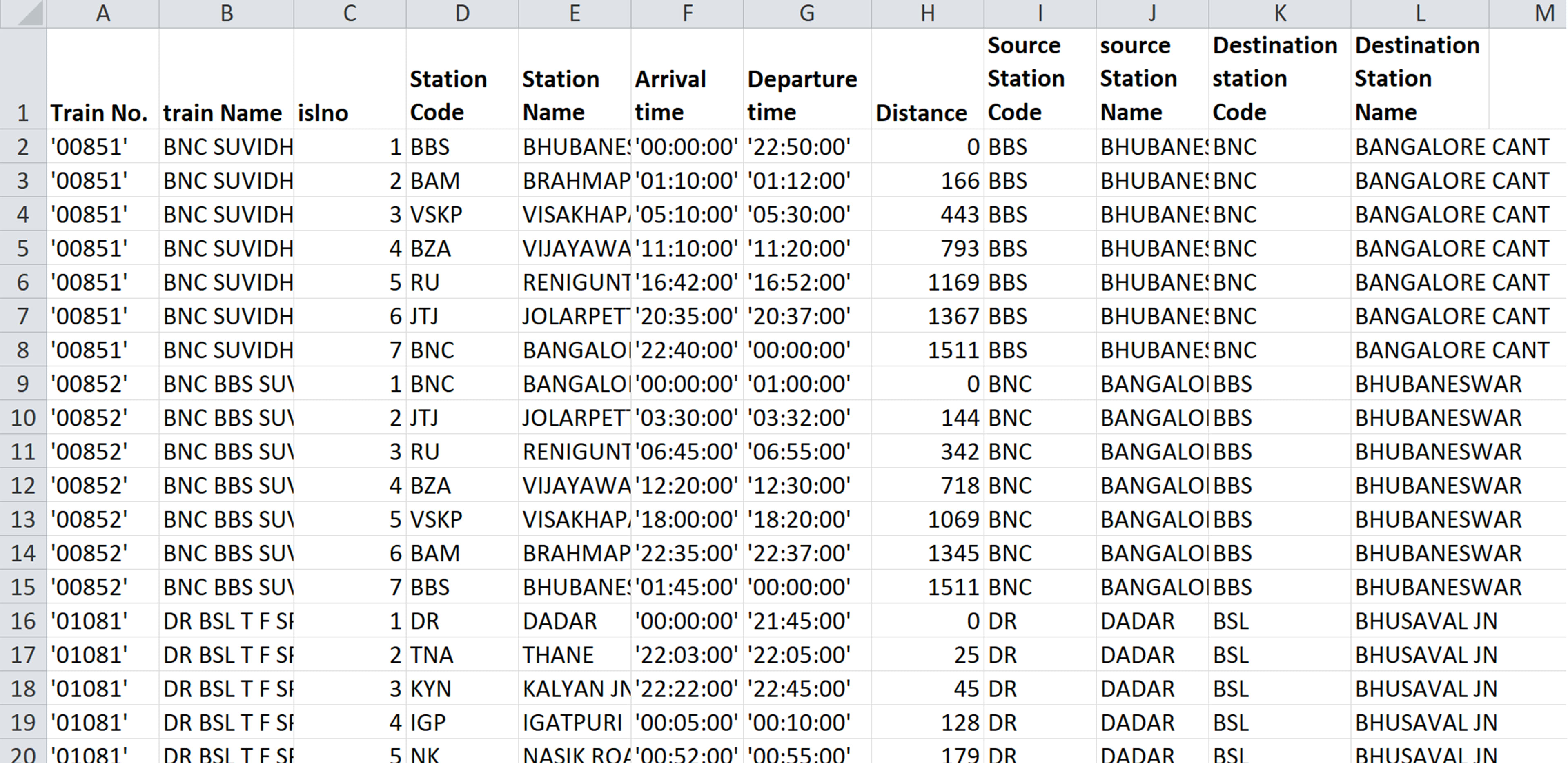
Train Route Data
The first set of data was downloaded from data.gov.in . The CSV file contains the train number, train name, intermediate stoppage list number, station code, station name, arrival time, departue, distance, source station code, source station, destination station code and destination station name.
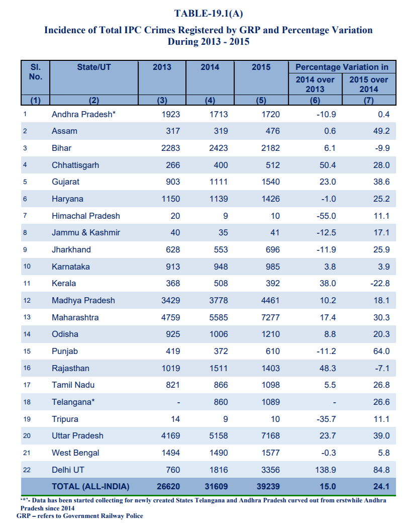
Train Crime Data
The next set of required data was of the railway crimes registered across the nation. The data was taken from the website of the Ministry of Railways, Govt. of India in the chapter titled 'Crime in Railways'.
Data Viz 1 - Thinner the path, safer the route
In this visualisation, two routes starting from Delhi to Ahmedabad have been shown. The first route starts from Delhi, goes through Haryana, Rajasthan and finally enters Gujrat to reach Ahmedabad.
The second route starts from Delhi, passes through Haryana, Uttar Pradesh, Rajasthan, Madhya Pradesh and then enters Gujrat.
The width of the route changes depending on the number of crimes registered. For example, in route two, the width of the route at two places changes significantly, first when it enters Uttar Pradesh and second when it enters Madhya Pradesh. Uttar Pradesh and Madhya Pradesh crime rank is 20 and 21 among 22 states for which data is available. This can clearly be seen in the visualisation. Hence if you’re planning to go to Ahmedabad from Delhi, you might want to consider taking the 1st route from the perspective of safety.

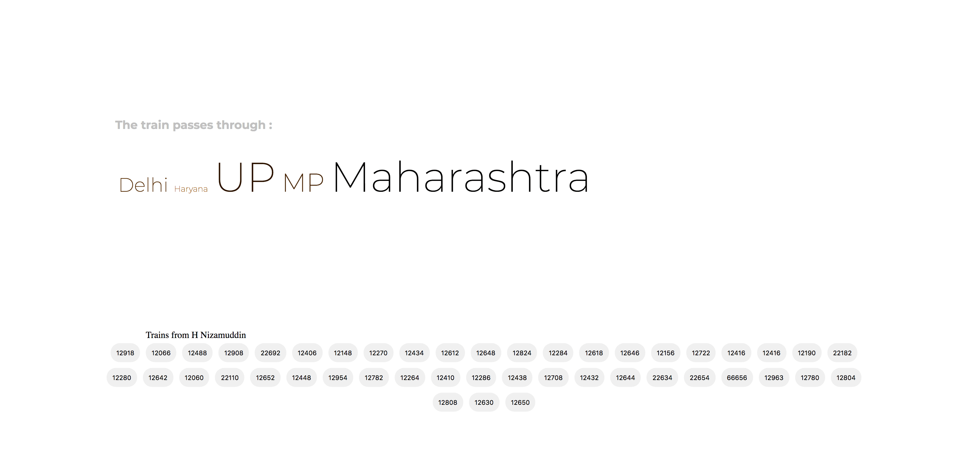
Data Viz 2 - The lighter the shade and shorter the length, the safer the route
The visualisation displays train numbers. On-click, the states through which the trains pass through becomes visible. The font size and color have been codifies according to the number of crimes registered in the state. This helps in perception of safety of the route. The bigger and darker the name of the state, more is the number of crimes registered.
This visualisation helps view many trains and also does not create any clutter on the display. One feature that has not been currently incorporated is the comparison of two routes.
As far as crimes rate is concerned, the number of crimes commuted and reported will also depend on the railway network density of the state. I haven’t yet tried mapping the network density vs the crime rates but it would also be an interesting study to do, especially if any outliers occur!!